Round. Rich. Familiar.
A proposed house blend with cocoa, caramel and toasted-nut tasting notes. Designed for espresso, flat whites and a steady start to the day.

Good coffee. Something fresh.
A brighter start to the everyday.
Explore a sample café menu and save a few favourites for your visit. Prices and dishes are illustrative.
Interactive concept. Your saved choices stay in this browser session; no order, booking or enquiry is submitted.
Something rich and chocolatey, or a lighter, fruit-led filter? Start with what you enjoy. Our concept coffee programme makes the choices easy to understand.
Find your next cupA proposed house blend with cocoa, caramel and toasted-nut tasting notes. Designed for espresso, flat whites and a steady start to the day.
A lighter seasonal selection with fruit-led tasting notes. Each release would include its producer, origin, process and roast date.
Simple options, explained clearly. Browse the sample menu and save your favourites before exploring the visit planner.
Build a sample visit around your day. This planner demonstrates how a café website can answer practical questions before someone arrives.
Concept experience: Morrow is not an operating café. This creates a local plan, not a reservation.
Yes. Choose Plant-based in the sample menu to find the relevant dishes. These are illustrative recipes; a live café would confirm ingredients and allergen information with its kitchen.
No. You can browse, save favourites and make a sample visit plan. Ordering, payment and bookings are not connected in this concept.
Verified opening hours, the address, transport links, step-free access details and a direct contact option. These would be confirmed with the café before launch.
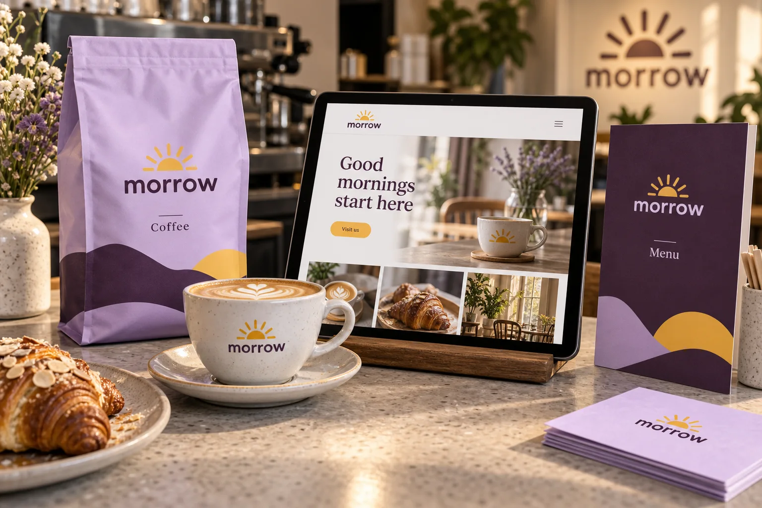
A warm wordmark, a rising sun and a recognisable palette connect the café menu, coffee packaging and responsive website.
Read the design story ↗Choose a palette and an application, then write a short message. See how a consistent identity adapts.
Up to 60 characters. Your message stays in this page.
Make room for something good.
EVERYDAY / REIMAGINEDDaybreak palette · Brand card
An SVG concept you can save and open in your browser.
The identity is designed as a toolkit: a consistent core with enough variation to remain expressive across moments and formats.
Soft geometry makes Morrow approachable while retaining a clear silhouette.
The sun device can lead, support or become a useful container for information.
Short, active language creates warmth without becoming overly playful.
Morrow is a café and brand concept built around a warm wordmark, a rising-sun motif, and a flexible colour family. The website brings the experience together: discover the menu, understand the coffee, save a favourite and plan a visit. The brand workshop below the café content shows how the same identity adapts across applications.
Discuss your brand with Air Form London ↗